
Index:
UPDATED ✅ Do you want to know how to make dynamic charts and customize them in Microsoft Excel? ⭐ ENTER HERE ⭐ and learn everything FROM ZERO!
Microsoft Excel is one of the most used tools by accountants, analysts, statisticians, administrators and many other professions. This is due to the ease of usethe distribution and the enormous number of tools and utilities that has.
Well, it is not only used to load data and perform calculations. East program also allows you to create graphs through tables used in the same document.
That is no need to make a bar scheme from scratch. only with indicate what the reference values are, Excel will do it for you. To learn more about this topic, We recommend the following content.
What is a pivot chart and how is it different from a regular one in Excel?

It is important to mention that there are two ways to create graphs through tables. The traditional way is done from the section “Graphics” which is in the tab “Insert”. However, there is another type of graph and it is the “Dynamic chart”. It takes data from a namesake table.
The main difference between the two is the source of your values. as we have seen one does it from a conventional tablewhile the other get the data through of a dynamic.
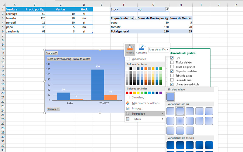
Which brings us to the second important difference. The filter option. which allows visualizeboth in the table and in the graph, group of values that share the same characteristics. To better understand this, take a look at the example image. You will notice that in the table and graph only those that “Yes” Have stock.
Learn step by step how to create and modify dynamic charts in Microsoft Excel
If you have multiple variables in your table and you need create charts in which you can filter information, we recommend that you use the dynamic method.
To do this you just have to follow these steps:
To create
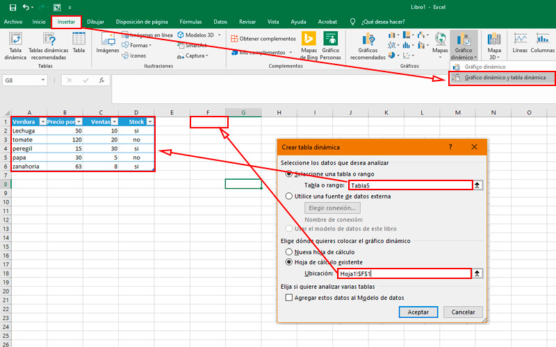
The first thing we must do once we have finished putting the data in our spreadsheet is format it as a table. In the picture we take as an example the weekly sale of a greengrocer. in which we place numerical values such as the price and the amount of sales. But also nominal such as product availability.
From this we can make the graph in this way:
- Go to the tab “Insert”which is in the list of options.
- In the section “Graphics” choose “Dynamic chart”.
- Doing this, it will display a small window with two alternatives. Choose “Pivot chart and pivot table” because we will use the latter for modify it later.
- when you do the previous stepa window will pop up “Create Pivot Chart”. What you should do here is tell the program where will you get the data to create the graph. In this case, we will do it with the whole table.
- In the second field we must complete in what document or part thereof representation will be placed. Which we will do in the same way, pressing on the cell that will serve as the upper left corner of the chart. Press “OK to finish this step”.
- Doing so will display a floating box and a side honeycomb. In the first one will place the chartwhile it is in the second where we will configure it.
- For it, drag the fields that correspond to the table to the lower areas according to the case. Following the example we will place the category “Vegetable” in “axes”, “Price” Y “Sales” in “Values” Y stock in filters. You can accommodate them according to your need.
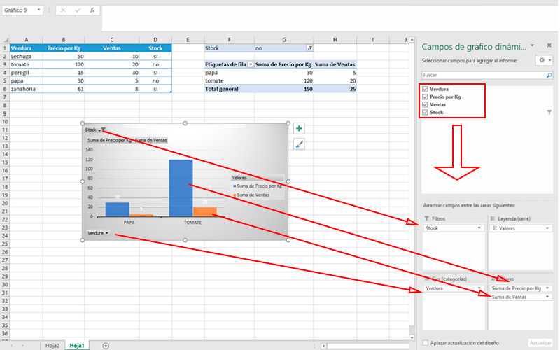
- You will be able to observe how shape the frame while you move these elements.
- On top of the graphyou can filter the data of the corresponding area. In the example it is stock. Pressing it will show only those that correspond to the selected element types.
- For change values of the graph, you will have to do it first In the table that we created at the beginning.
- To see reflected modificationsclick on the chart box with the right mouse button and choose “Update data”.
- You can also change add or remove categories in the side panel areas.
Personalize
Bearing in mind that a presentation must always be accompanied by a interesting design. Excel adds to its profits ability to customize pivot tables. Doing it is very simple.
Take note of these steps:
- Select the outline box.
- You will notice that they appear two buttons. The first provides the option of add or remove elements to the drawing. and is symbolized by a plus sign. pressing on it you can addfor example, a title or a trend line.
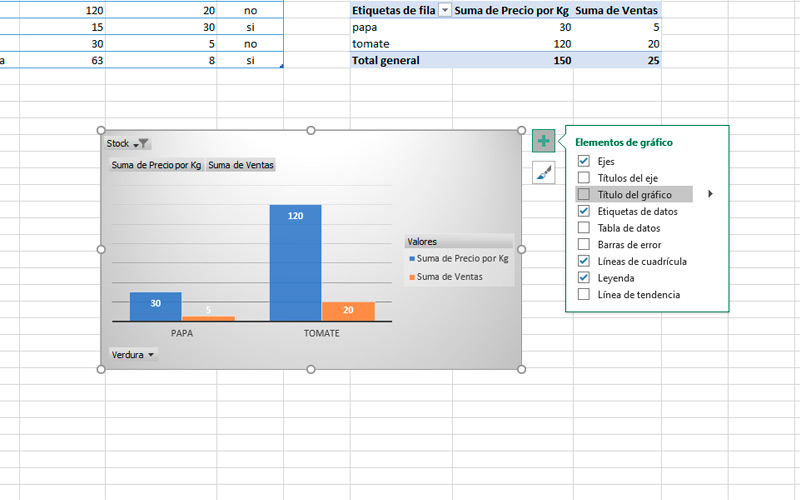
- For change the look style click on the brush icon that appears above the previous button.
- You will see a window with two categories. In the first, called “Style” you can choose between several display alternatives. In the second, you have color palettes with which to combine your graphic.
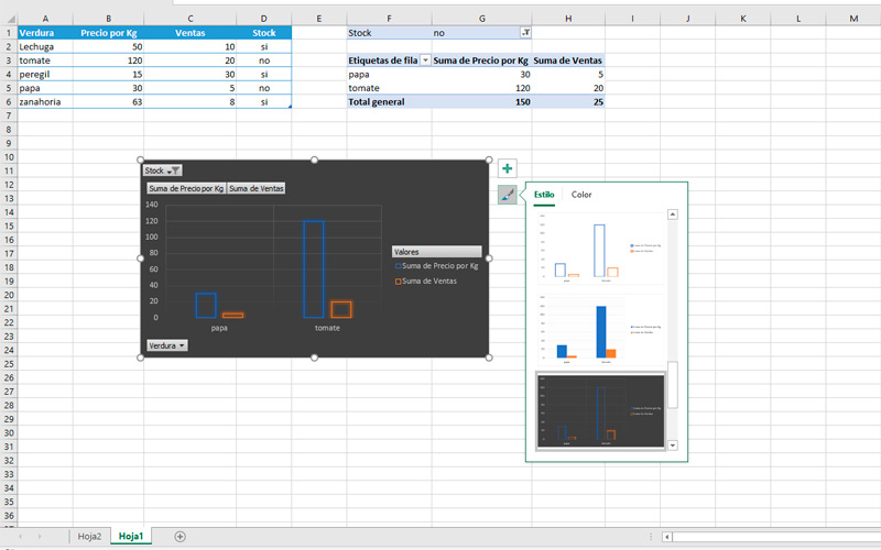
- As if this were not enough, pressing the secondary button about him you will access other alternatives of personalization.
- These are the fill and outline colors. The first is symbolized by the traditional jar of paint and the second for a pencil. in both options you can choose between all the color variants offered by Microsoft.
- It is important to mention that you can also change chart locationwith only drag it in the document.
Computing