
Index:
UPDATED ✅ Do you want to know how to make a climogram with Microsoft Excel tools? ⭐ ENTER HERE ⭐ and learn everything FROM ZERO!
A climograph is a visual diagram in which are shown the rainfall and temperature values from a specific location. In general, the measurements are separated by months during a year. This type of graphic used to perform comparative analysis over a period of time with climatological variables.
elaborate this diagramit can be cumbersome if you use programs of presentations or text. Nevertheless, use Microsoft Excel to do this, it won’t take more than ten minutes.
For this reason, we present this post to you, where you will learn to create your own climograms and take your analyzes to another level.
What should we take into consideration when making a climogram in Excel?
The first thing to note is that there certain rules when making one of these graphs. Both its form and its content must be meticulously crafted.
As a general rule, it represents simultaneously the values medium temperature of each month and corresponding precipitation the same. In the first case, use a continuous linewhile in the second one uses vertical bars.
are taken the twelve months of each year during a period of 20 or 30 years. (This in a professional job done by climatologists. However, if it is a pastime or hobbyyou can take a smaller sample for practice).
The data you collect must be taken from reliable sources Like the weather services nationals or universities. Needless to say that must have the same unit of measure. You can make the conversions online with the google search bar.
The arrangement of the axes must beby consensus, in such a way that in the horizontal they are located months of the year, from January to December. While in the verticals (carries two) is located on the right average temperatures on a 5 degree scale.
On the left axis is the scale of average monthly rainfall, at a double scale compared to the previous one, that is, every 10 millimeters. The reason for the difference in measurement between both vertical axes is that in this way an aridity index can be applied. And so check if there is a dry seasonas well as its duration.
Steps to make a climogram in Excel to keep track of weather data
The first thing you should do is have the table of measurements you want to analyze. It will have to contain monthly averages for a specific location.
As an example, we will use the following table that corresponds to the city of Madrid during the year 2012:
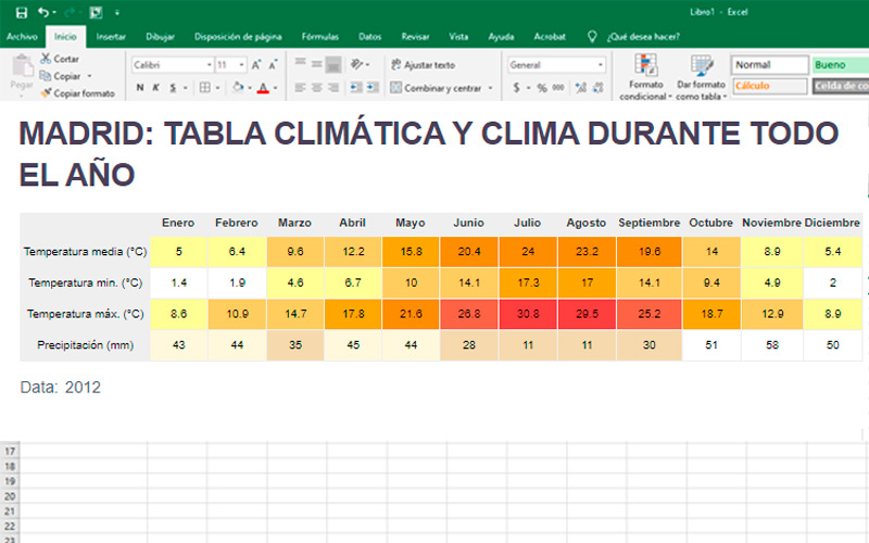
Once you have the information ready, you just have to follow these steps:
- Start microsoft-office in any version.
- Create a new book in white.
- transcribe the data to the table, paying attention not to miss any number.
- Next, create a new line chart. You will get it by pressing the corresponding button in the section “Graphics” which is in the tab “Insert”.
- By doing so, will create a blank boxyou can move it and place it where it is most comfortable for you.
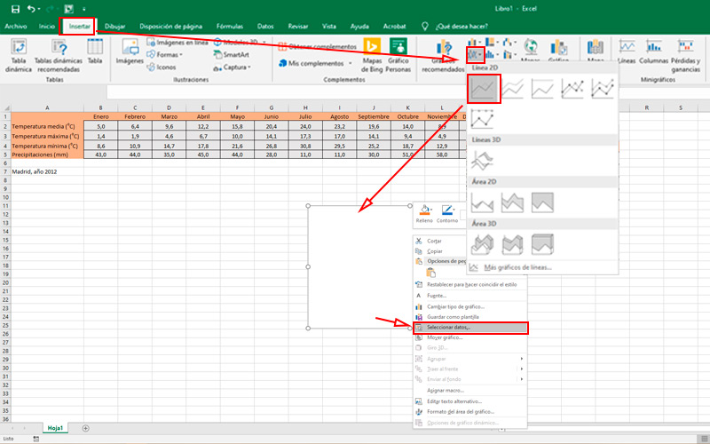
- Now is the time to add information to our blank schema. To do this, press the right mouse button on it and choose “Select data”.
- In this small window, press the button “Add”, a new box will appear, where you will have to put the name of the series. However, it is most convenient to select it from our table. Which in the example is “Medium temperature”. In values, delete the content “={1}” and replace it by choosing the measures that correspond to the previous item.
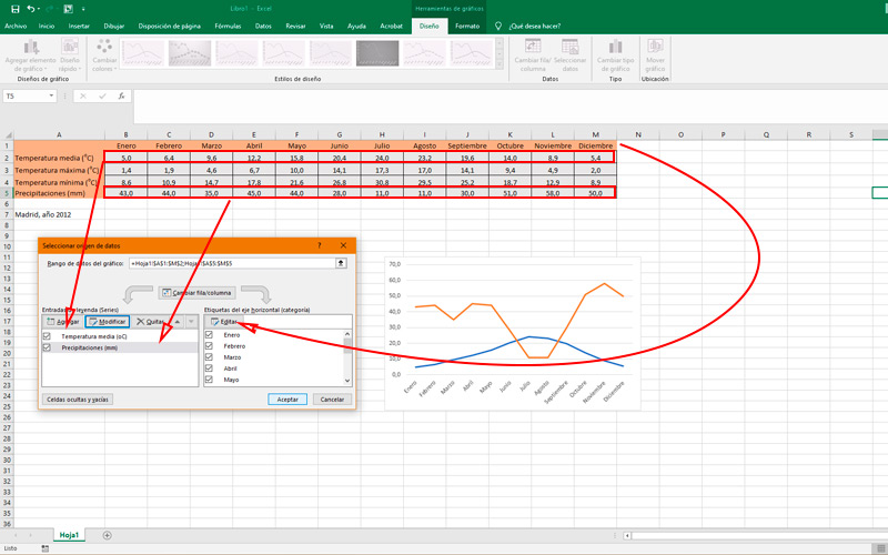
- Press “To accept”.
- Do the same steps, but this time with “rainfall”. If you make a mistake in these steps, don’t worry, use the button “Modify”.
- In the column on the right are numbers of the 1 to 12which we must replace with the months. To do this, click on “Edit” and then select the same from the first row.
- touch “To accept”.
As you can observe, both measurements are expressed in lines. Being that the precipitations must be in vertical bars.
To change this, select the line that corresponds to it (in this case the orange one):
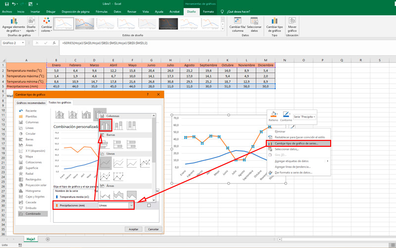
- Right click and choose “Change series chart type”.
- In this menu, tell the program that the series “rainfall”must go in “Clustered Columns”. To do this, display the sub menu which is to one side.
- press “To accept”.
As we mentioned before, a climogram must carry two vertical axessince they use two different scales.
By default, Excel associates both series to a single series:
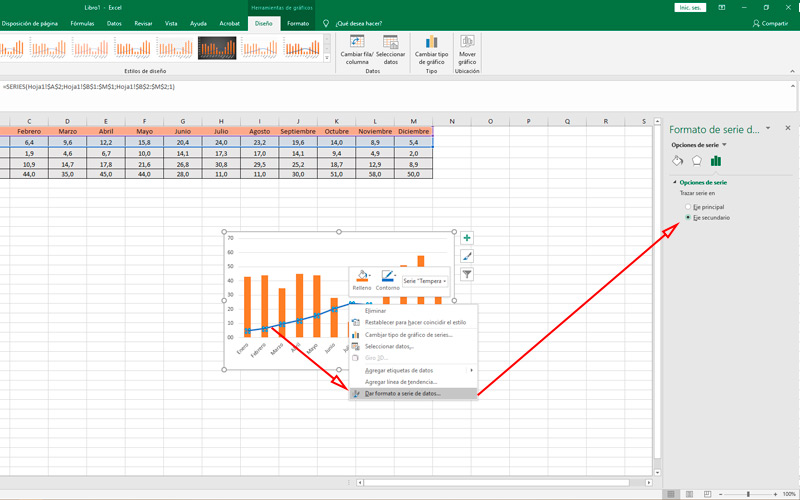
- To change this, press the right button on the average temperature line and choose “Format data series”.
- A Side panelin which you must indicate the latter as “secondary axis”. Here you can also personalize the colors of the lines and bars If necessary.
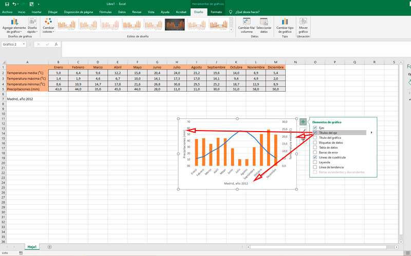
- now that we have two different scalesit is precise name the axes. You will achieve it by clicking on the sign “+” in the upper right corner of the schematic and selecting “Axis Title”.
- change the names and optionally do match the colors that correspond to each type of graph.
Make sure that both vertical axes respect the scales that we mentioned before. That is, every 10 mm of rainfall and every 5 degrees in temperature monthly average.
Then follow these steps:
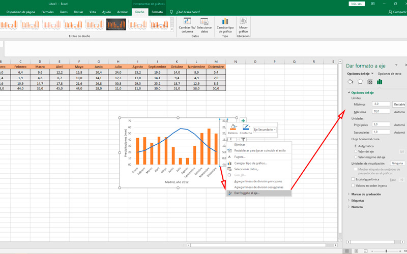
- To do this, right-click on one of them and choose “Format Axis”.
- Then in the Side panelmodify the limits and units. Which should be the same in all the climograms you make in the futureto give meaning to the study.
- In the example, we add 5 negative degrees at medium temperature.
- You may change the size of the climograph dragging the end points of the box.
- Save your document by pressing “Ctrl + G” or in the tab “File, Archive”, “Save”.
Computing