
Index:
UPDATED ✅ Do you want to know how to measure the appearance of a pivot table in Microsoft Excel? ⭐ ENTER HERE ⭐ and learn everything FROM ZERO!
One of the main advantages of working with this program is that it allows you to create different types of pivot tables where you can include each of the data you think necessary. You can create them according to your needs, thus allowing you to choose the table’s own style and format.
Therefore, at the time of create these elements you will have the opportunity to change their appearance. All this with the aim that you can improve layout and formatting for them to be a lot easier to understand and analyze each of the data. It must be taken into account that at the time of apply it they will take on an aspect already defined by the program.
Can modify the appearance of these elements it will permit you change the way columns, fields, rows, cells, lines are displayed, among many other aspects. All this will allow you improve presentation and to be able to make them a lot easier to analyze. According to this, here we are going to explain a little more how you can carry out this process easily and quickly.
What aspects of a pivot table can I modify to change its appearance?
When working with dynamic tables you will have the opportunity to have 83 pre-designed styles different from what applies by default. So you can count on one wide variety of totally different styles and that without a doubt will offer you a better image compared to the one obtained by default.
All this will help you your table is much more attractive to the reader and that they are also a lot easier to understand. So here we are going to show you what are the aspects that you can modify and that will allow you to change its appearance.
Apply bands to each of the grids
This is recommended especially when the table has a large number of rows and columnsso it becomes a very good alternative to be able to add rows with bands that will allow reading the data can be done without many complications.
In order to apply this modification it is necessary that you locate yourself in the “Active cell” on the pivot table.
Then you have to go to the tab “Design” located on the ribbon and there select “PivotTable Style Options.” Now you need to check the box “Rows with bands and columns with bands”.
Once applied this you will have the following result:
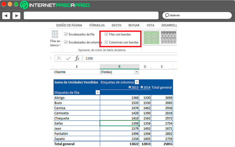
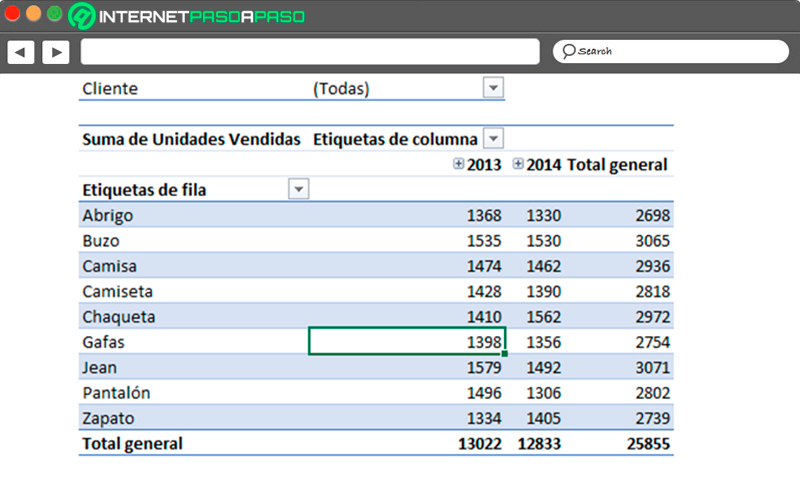
Mainly the option of banded columns is skipped by almost all users, This is because the option rows with band is more than enough for the table is understandable and very good looking for readers.
When applying this single element you will have the following way:
Format the value area
when you want change the look of this type of elements it is also very important to take into account the format of the values, since only the appearance is not important in these cases.
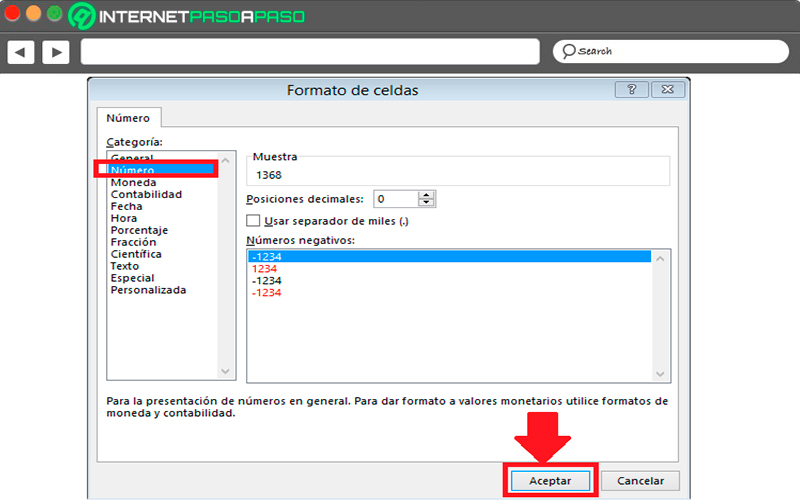
In order to carry out this modification, it is necessary that right click on the pivot tablethen you must select “Number format”.
Now in the dialog “Cell format” you shall choose the number category and decrease the decimal place to 0. Finally click on “To accept”.
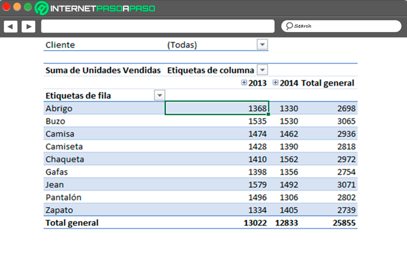
You can too Apply the format of “Coins” Y numerical data will take the following look.
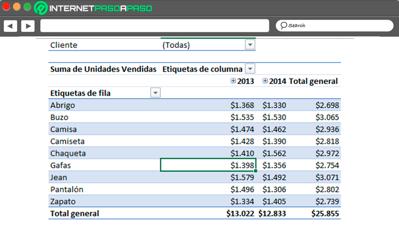
In the same way you can try each of the options that appear available there until you get the one you want. All this will help you give another type of format to the values with which you are working.
Delete empty cells
One of the biggest problems when working with tables are those cells that remain totally blankso the value of the same is zero. An excellent option for them is to eliminate them. Which will allow you to get a better visual aspect in the element.
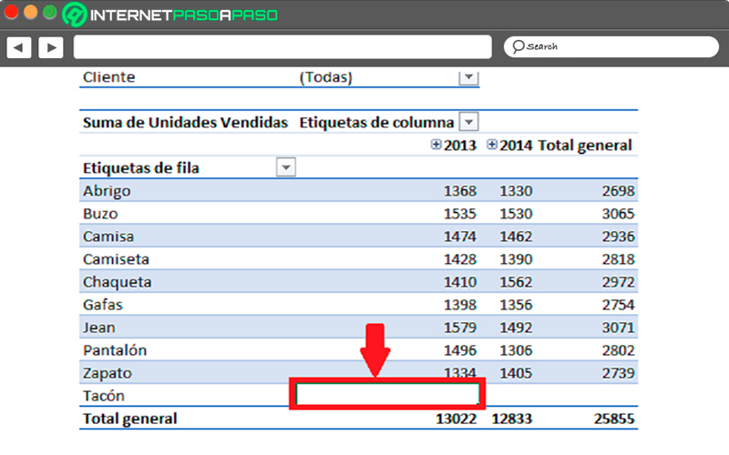
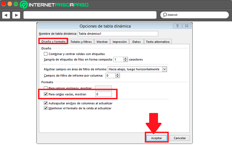
Every time this happens, it is best to display a different character than a empty celleither the number zero. To achieve this you must right click on the pivot tablethere you must select “Pivot Table Options” and in the dialog box that appears on the screen, you must go to the tab of “Design and format”.
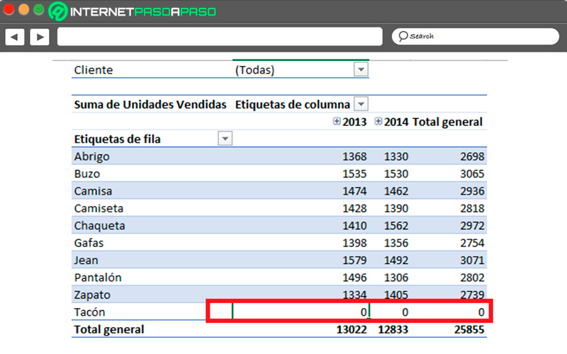
Now you must enable the box “For empty cells, show” and in the text box you must write the number 0. Finally, you must click on “To accept” for the changes to take effect. In this way you will be getting all tables that remain in white have the value 0 in them.
Modify the labels
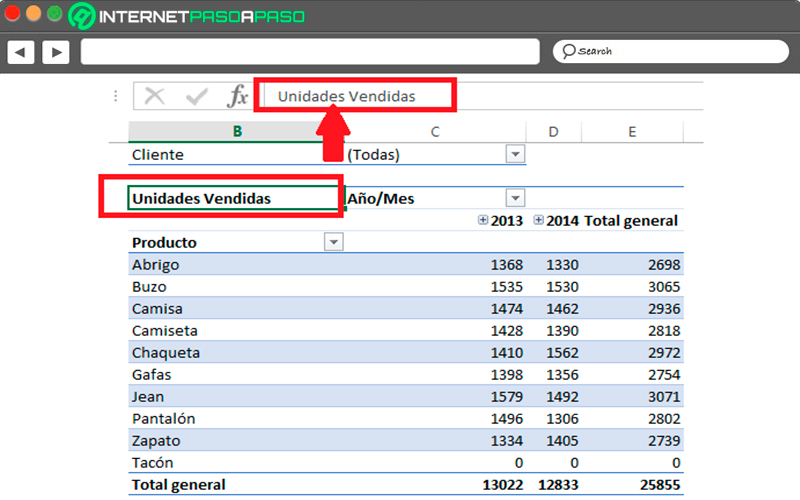
Every time you apply a default pivot table you can see that the labels for the different areas are not very descriptivewhich can cause the aspect of the element looks very simple. Being able to modify this will allow you to get a more attractive and clearer presentation.
To change labels what you should do is locate active cell on the label you want to modifythen you must go to the “Formula Bar” and there you change the name to the one you want.
Show or omit grand totals
Not all the time it is convenient to have totals general within these dynamic tables, since this will depend mainly on what you want present in them. Therefore, it is a very good option. whether or not to omit grand totals for rows and columns.
To run this procedure you need to go to the “Design tab”, there you must go to “Design Group” and click on “Grand Totals”. In the drop-down list that appears you must choose the option you need, in this case you must disable it for both rows and columns.
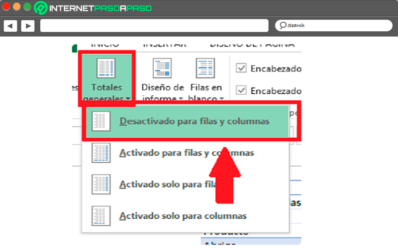
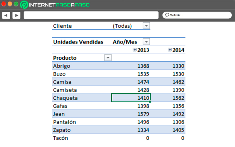
How can see in this image, the pivot table no longer has grand totalsince in this case it is not necessary.
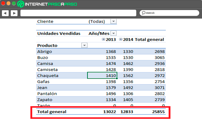
If you want it to appear again in your elementthen you must repeat the whole procedure but now you must “Activate for rows and columns”, this will make the Grand Total reappear there.
Modify the structure of the table
If what you are looking for is a different look for your table then you should modify the “Report design”, For this you must go to the tab of “Design” and then to the group “Design”, there select the button “Report design”.
As you can see there you will find different options so you can change the structure of your pivot table and thus give it another appearance.
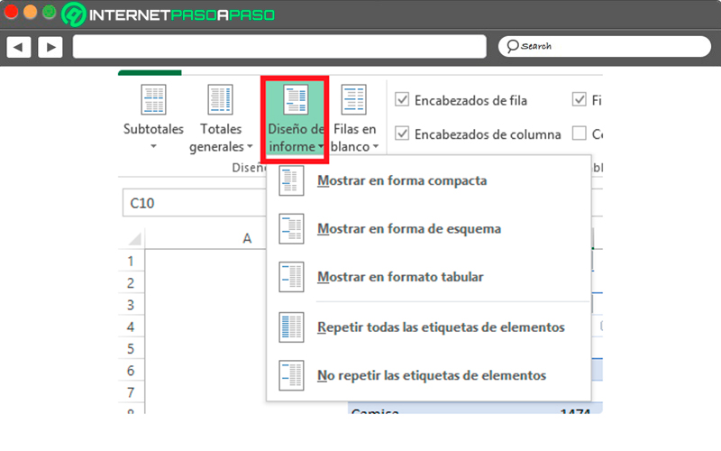
show compactly
This is the configuration that the program assigns to each of the tables by default, it allows group all the elements found in the rows. This allows it to be save spreadsheet space and in this way to be able take advantage of the space the same in a better way.
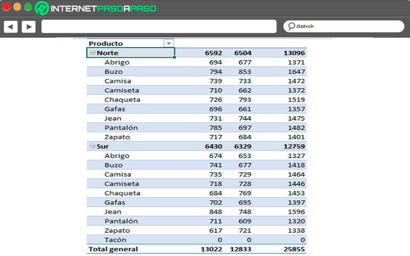
Show in outline form
Another way of display table data is through outline shape, in this case it is select each of the fields in the row area and add it to an individual column.
Which will give you the following:
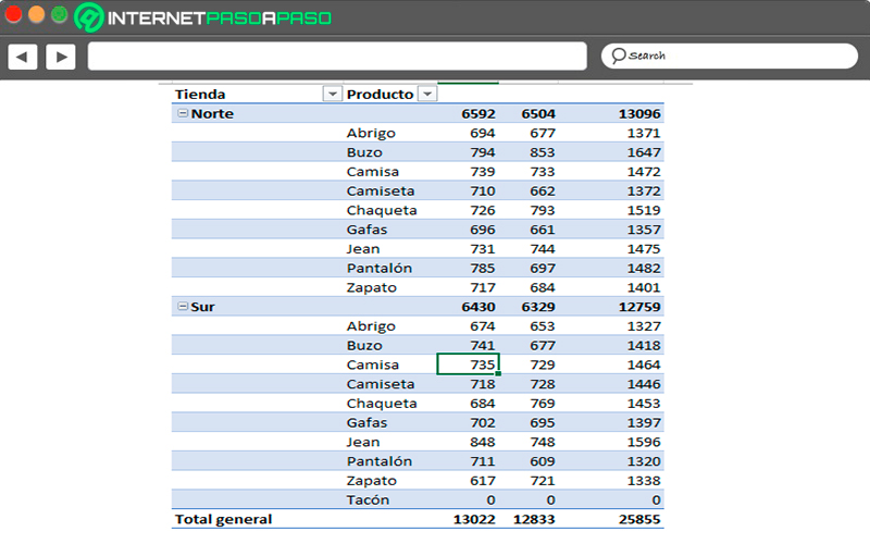
Show in outline form
Another way of display table data is through outline shape, in this case it is select each of the fields in the row area and add it to an individual column.
Which will give you the following:
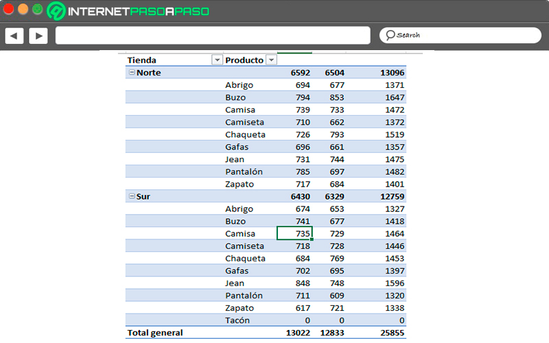
In the event that what you need is a table to create a more advanced data analysisthen you can use the option of “Repeat all element tags” which is also found in the tab “Design” in the option of “Report design”.
Once selected, the following will appear:
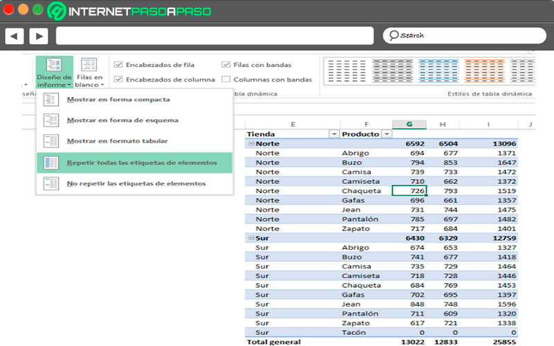
Here you can fill the corresponding fields in a simpler way, this way you will have the opportunity to manipulate more easily each of the data for future analysis.
Show in tabular format
The same thing happens as in the previous section. outline formatin this case also split row fields into different columns and are displayed subtotals for each of the categories.
All this will be as follows:
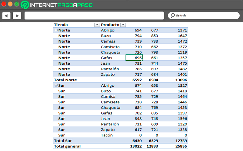
Please note that the design of these tables basically is selected depending on the objective of the sameso it is necessary to know what you want to reflect in it to know what you can choose and that ends up being the most suitable for what you are looking for.
As you can see, all of these are the most basic aspects of pivot tables that can be modified in order to get a better look and better display in them.
Learn how to fully customize Excel pivot tables to make them more attractive
taking into account all the aspects that can be modify in pivot tables, the next thing will be to explain how can you do this process easily.
To do this, you will need to follow each of the steps that we will indicate below:
- If what you are looking for is to get major changes to table layoutand in turn make it much more interesting and easy to understand for readersthen you will need to start change each of the following.
- Compact format: When this is chosen format type they are going to you display row area field items in one column and an indent will be used to be able to differentiate the elements of each of the fields. In the case of labels, these are usually occupy less space in the compact format, so you can take advantage of the rest of the space for others data to insert into the table.
You will also have the opportunity to appreciate what are the collapse and expand buttonsthese will allow you show or hide table details.
Therefore, the compact format allows you to do that the table is much more readable and in turn you can save a lot of space in the spreadsheet.
Let’s see below:
- Tabular format: In this case it will display a column by field and will provide a space for field headers.
- Outline format: As mentioned earlier in the post, it is very similar to tablebut this can show subtotals at the top of each group. This is because the elements of subsequent columns are displayed in a row below the current item.
To change your table to any of these three formats you must perform these steps:
- Click anywhere on your table in your spreadsheet.
- Here you will be shown the tool pivot table on ribbon.
- Now in the tab designin the design group, you must select “Report design”.
- Here you must select the option “Show in compact format” so that the data does not spread landscape shape off-screen.
- In order to apply a scheme a data in classical style you must click on “Show in outline format”.
- to see all data in a format of traditional table then you should select the option of “Show in tabular format”.
Change the organization of the fields in the table
This point is very important in order to obtain the final design what do you want in your table, this will allow you add, arrange, and delete fields with the pivot table field list. In order to see this tool, the table must be selected.
Once you select the tab “Options” you will find the group “Show or hide”, here you must select “List of fields”.
In case you can’t find the fields you want to use in the field listthen you may have to update pivot table so that show the new fields that have been addedas well as calculated measures, dimensions, and calculated fields.
To update them You must go back to the tab “Options”, then go to “Data” and there click on “To update”.
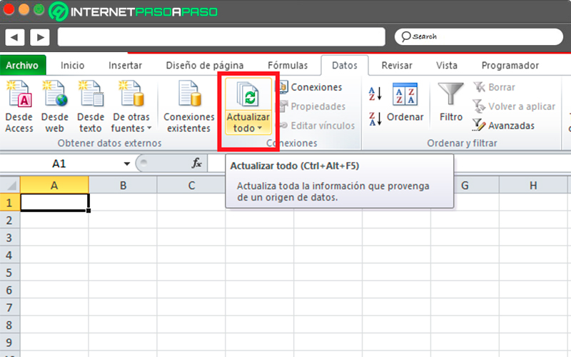
Modify the way element labels are displayed
- At this point you must select a field the row in the pivot table. Here you will be shown the pivot table tool tab on the ribbon. You can also do it by double clicking on the field the row in outline or tabular format.
- Now in the tab “Analyze” or “Options” You must select the “Active field” and then click on “Field Settings”.
- In the dialog of “Field Settings” You must select the option “Design and impression” and then the section “Design”.
- So that they can be displayed elements in outline formatyou must select “To show element labels in schematic format”.
- So that show or hide field labels next of the same column in the compact format you must select “Display element labels in schematic format” and then “Show next field items in the same column.”
- Finally, to display the field elements in the table format, you must click on “Display item labels in tabular format”.
Modify layouts for rows, columns, and subtotals
To improve the design of these tables it is necessary to perform changes that affect the layout of both columns, rows and subtotals. For this you can rearrange individual items in a row or columns.
This way you can disable or enable row and column field headers:
- The first thing is to click on the pivot table. There you will be shown the “pivot table tool” on tape.
- In order to switch between hide or show field headersyou must go to the tab of “Options” and in the group “To show” select “field header”.
Now if what you want is to show the subtotals above or below the rows you will need to perform these steps:
- In the pivot table you should select field from row in which you want subtotals are displayed.
- There you will be shown the “Pivot Table Tool” on the ribbon.
- Now in the tab “Options” you should go to “active field” and there click on “Field Settings”.
- The next thing will be to go to the dialog box “Field Settings” and in the tab “Subtotals and filter” Choose “Subtotals” and then “Automatic or personalized”.
- Inside the tab “Designs and printing” select the item from “Design” and then in “Show element labels in schematic format”.
- now you must Activate the box of “Show subtotals at the top of each group” for them to show subtotals above the subtotal rows.
- For deactivate the box you must “Show subtotals at the top of each group.”
Computing