Index:
UPDATED ✅ Do you want to know more about how to change the type of graph in Microsoft Word? ⭐ ENTER HERE ⭐ and learn everything FROM ZERO!
Microsoft Word is one of the most popular word processing programs in history. It is largely due to the number of tools you haveupdate and add with each version.
In this way, it is no longer a writing software. But it has become a fundamental pillar when it comes to compose documents with textual elements, images, links, and graphics.
With respect to the latterwe can say that it is one of the most used, especially when you need make a presentation. There are several models to choose from. In this post we will deal with discovering what if we want to change it.
What are the different types of charts that can be inserted into Word?
Surely you know they exist several ways to represent data in a graphic scheme. This is because there are different types of values. For example, if we wanted display percentage information on a totalideally we would use a pie chart.
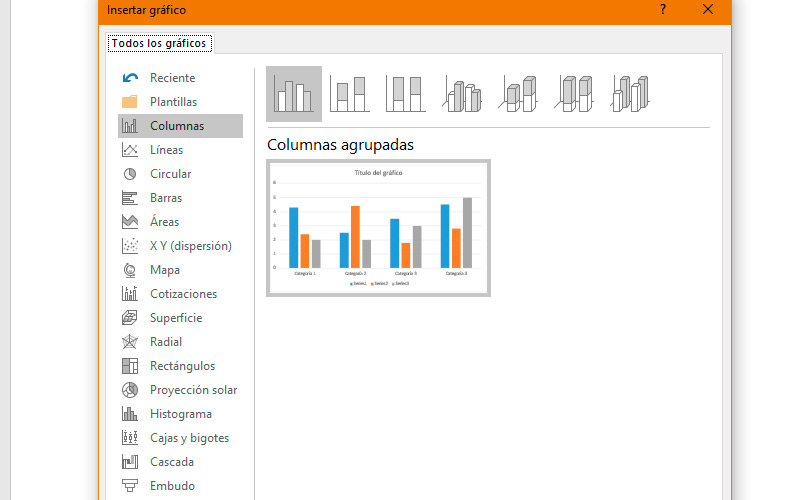
And in this way many more can appear. Fortunately, Within Word, we can find more than sixty different designs to choose from. In this sense, it is important to mention that sorted into categories that make it easy for us to choose.

Within them the variations between designs are minor.
So we will name the most important sections:
- The first to appear is “Columns” and is characterized by arrange the data in horizontal boxes staked on a horizontal axisthe categories are placed in it, while the values do it in the horizontal. Among its variants we find the frontal ones in 2D and 3D with perspective.
- Next on the list is “Lines”which are conducive to plot data trends over time. Therefore, it is recommended in case of have different data sets. These are continuous lines that cross the horizontal axis and form curves according to the values of the vertical axis.
- Next, we find “Circular”. As we mentioned at the beginning, is ideal for percentage data, in which the sum of them represents the entire circle. As for the individual values are divided into the corresponding angles of the percentage. Regarding this category, it is important to mention two things. It is not recommended if you have more than one data series. And the second is that within this category we find models with subgraph. Ideal if you want to expose a sample segment.
- Fourth, we find the graphics of “Bars”What are they similar to those of columnswith the main difference that categories are located vertically and the values in horizontal. This is a very useful option when we have very long axis labels. Like the first ones, they have versions in two and three dimensions.
- Followed by the latter is the category “Areas” which has similarities with “Lines”. However, the end is different, since the impact offered by one area over another, will favor us if we want to expose the total value of one trend over another.
- “XY type”. This category offers us a punctual display of values in the XY plane, so that we can recognize sectors and groups through small circles. It is often used for scientific, statistical, or engineering purposes.
- If you need to carry out a study that includes values from different countriesyou must try the category “Map”. The same will be represented on a planisphere next to a monochrome scale which will account for the values. You can also use different colors per category instead.
- The next section is called “Quotes” and it is directed to the same. It can be indicated through this graph the highs, lows and closings of a temporary period. It is important that the table from which the values will be taken have these parameters as headers.
- Halfway there we find the graphs of “Surface” and just like a topographic map shows us a variable surface area. It is separated into colors that indicate similar values between categories and variables. As long as these last be numerical.
- “Radial”. It is very useful when needed compare multiple data series at the same time. They do this on a flat surface with edges representing the values.
- The category “rectangles” resembles the “Circular” in their function, with the obvious difference in form. Nevertheless, best expresses the data when one of the variables is zero.
- The next kind of graphic is called “sun projection” and although it sounds very mystical, it is a logical way of hierarchizing series of values. Being those of the central ring the most important and descending in category as they extend abroad.
- “Histogram”. This way of data graphis recommended when we want represent a sampling of frequencies within a distribution. In such a way that each column (class) can be edited to analyze in depth the data it contains.
- The category “Boxes and Mustaches” it is a graph for a more complex data type. and used when we have several sets of information related to each other. In turn, factors such as “Half”, “Atypical values” either “minimum and maximum”.
- The financial professionals are familiar with the category “Waterfall”. This type of scheme is used to understand how an initial value is changed by a series of positive and negative arguments.
- form and representationgo hand in hand with the category “Funnel” since it is generally used for decant values through processes or a segment of time.
- Lastly, we find “Combined” which are graphs that use elements of two types. overall of columns and lines. They function primarily to display the relationship between two data series.
What should we take into account before changing the type of graph?
Having such a variety of graph shapes and functions present at Microsoft Word, it is normal that we decide to change the representation. And with this certain doubts arise, such as whether data will be lost or if can be recovered. For this reason, we present some considerations.
The most important thing of all is to tell you that when replacing one graphic model for another, data will not be lost. In the worst case, will be rendered incorrectly. Which brings us to the next clarification.
Always you can go back to the previous model. For this you can use “Ctrl+Z”. Doing this, you will step back to the original form of the graph.

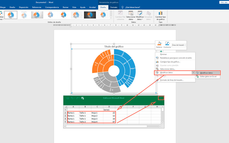
The values What do the models represent? are in an excel table. To access it, right-click on the schematic and choose “Modify data”.
In some cases, it is advisable to create the graph first and then the table. For example, with the category “Map”. By doing it this way, the Excel spreadsheet will already provide us with an established order to enter the data. Doing it the other way around could give undesirable results..
Steps to change the chart type in a Microsoft Word document
Taking into account the above considerations, the time has come to show you how to switch from one chart model to another.
To do this you just have to follow these steps:
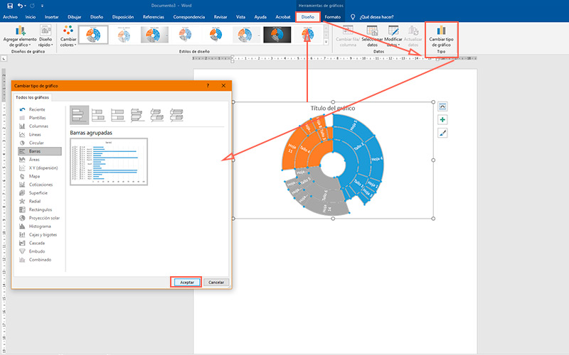
- select chart what you want to change
- You will notice that a new tab appears on the ribbon called “Chart tool”. Choose “Design”.
- In the section “Guy” press the only button “Change chart type”.

- will present a new window, with all the categories and models that we named before. You should know that, depending on the form and content of the corresponding table, some layouts will not be supported.
- Choose the new shape and press “To accept”.
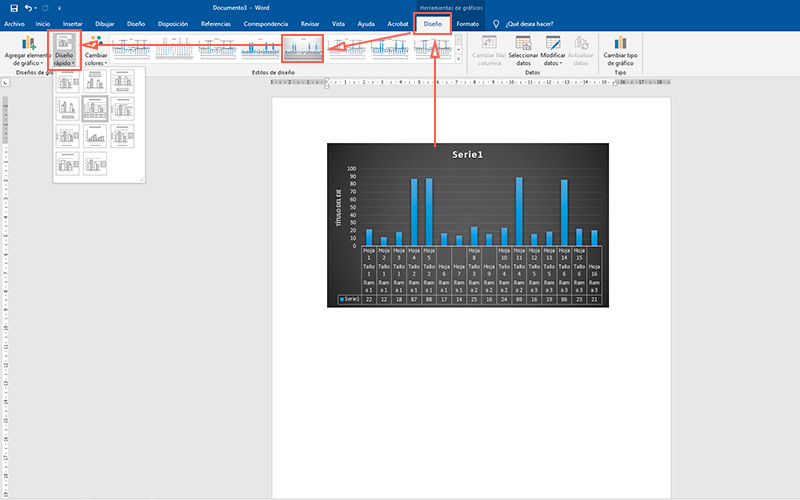
Within this tab, you can also customize the colors of background bars and other elements. Although more important, it is possible to modify the distribution of the scheme through the dropdown “Fast Design” which is in the section “Chart Designs”.

Software