Index:
UPDATED ✅ Do you want to know how to create graphics for your documents using SmartArt in Excel? ⭐ ENTER HERE ⭐ and learn everything FROM ZERO!
One of the computer programs developed by microsoft most used in the office environment, without a doubt, it is Excel. Which, is distinguished from the rest, by facilitating the work with multiple numerical data to analyze them and generate reports through tools such as pivot tables and charts.
In this sense, one of the illustrations most commonly used in spreadsheets Excel, are SmartArt graphics that offer the possibility of making a visual representation of any flow of information, quickly and simply. So that, they stand out for being ideal elements to transmit your messages or ideas effectively through Excel.
However, many users do not know how to handle this graphics typenamely, create and select them correctly, according to the type of data they want to present. Therefore, through this post, we will teach you How to create a quality graphic with SmartArt in Microsoft Excel.
What is a SmartArt in Excel and what is it used for in our documents?
Basically an element Smart Art in Excel is defined as a visual representation that allows to show, in an attractive way, any idea, concept or information. Therefore, they are illustrations that are designed to add text or numbers, for the purpose of presenting any kind of data.
Therefore, through a smart art graphic trying to convey the information in a dynamic and easy to understand way. Therefore, they are elements that contribute to communication of the message is better understood by users.
Now, beyond this, the Excel SmartArt graphics They serve a significant amount of Actions that can be carried out from said program microsoft.
So, in order for you to know how to differentiate them and choose them correctly, here we present the main uses of SmartArt in the spreadsheet:
- To create a Organization chart.
- Enumerate any amount of data.
- To show the steps, the phases or stages of a process or workflow.
- Introduce the flow of a process, procedure or other event of this Type.
- To exhibit a hierarchy. Like, for example, a decision tree.
- Elaborate an illustration of form matrix.
- Represent type information cyclical or repetitive.
- Express a relationship between several parties, such as overlapping concepts.
- Organize an illustration, very quickly, by typing or pasting the text to make it position and set automatically.
- Reveal one information proportional or hierarchical in an illustration pyramidal.
What are all the types of SmartArt that we can use in Excel?

Now, since the graphics Smart Art in Microsoft Excel allow to display or expose a great variety of information, of course there are several types of them that must be selected depending on the data to be presented.
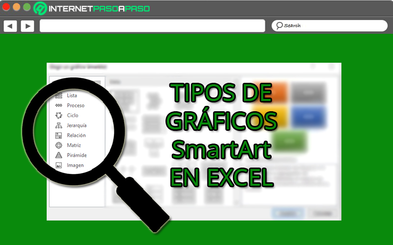
Therefore, in order for you to display the data you want in these visual elements correctly, below, we will introduce you to each of the types in order to discern their main uses:
Ready
It simply refers to a chart that uses a list type layout and in consequence, keeps the idea of the list vertical. Therefore, they are ideal for grouping all that information interconnected that do not follow a process sequentially.
Now most of these chart types they separate the general concepts from the details or secondary ideas. Considering that, the main points of the elements are the ones that will gain greater visibility and impact. In addition, they allow you to add image shapes to accentuate the information through drawings or illustrations.
Process
This is a kind of smart art graphic that features repeating shapes and a long winding arrow through which each step can be connected. Thus, they are elements that have a directional flow and thanks to that, they are used for represent the stages of a process or a sequence of stepsunlike graphs of type Ready.
Generally, these types of illustrations are used to show the evolution of a specific procedureAs for explain each of its phases or stages with the aim of reaching a final result. Taking into account that, depending on the process to be exhibited, you can choose between more than 30 subtypes.
Cycle
from this one on class of design, a circular, cyclical or repetitive process can be illustrated, as its name indicates. Consequently, the smart art graphics of type Cycle are used to communicate data, ideas or sequential concepts that are renewed at the end of the last phase.
So, for example, they are illustrations that can be used for show the life cycles of animals or productspresent an ongoing process, explain the learning phases, state the goal-setting cycle each year, teach employee performance review in a business settingetc.
Hierarchy
They are those illustrations that simplify the presentation of information in a hierarchical manner. That is, they allow to show the order of the elements according to its value and according to typology or category criteria to develop a classification system. Therefore, they are used for make a company organization chart or show decision treesfor instance.
Now, it should be noted that there are several subtypes of hierarchy SmartArt elements in Excel and among them, the most used are the following:
- architecture design
- Hierarchy List
- horizontal hierarchy
- Organization chart with semicircles
- Hierarchy with images in circles
- Labeled Hierarchy
Relationship
Through this type of graphicsit’s possible show non-progressive and non-hierarchical relationships between the parts of a whole.
Which means that they are elements with which you can represent the links between two or more sets of things, as well as exhibiting conceptual relationships. Therefore, all the information shown interconnected.
On the other hand, depending on the exposure of the information, there is the possibility of choosing several subtypes of Smart Art of Relationship and one of the most representative of all, are Venn diagrams. Which, are responsible for showing how the concepts overlap and meet at a central intersectionin order to establish a link.
Matrix
They are defined as a type of two-dimensional graph which generally allows rankings among exposed data.
Which means that they show the relationship between the components of a whole and manage to symbolize totally complex links, through axes. Thus, they are used to display the multi-part loop about a central concept.
In this sense, it is pointed out that this class of illustrations available in Excel are ideal for expressing a large amount of text in the documentin a simple and summarized way, through four key points. In addition, outside the representative quadrants and axes of the graphs of Matrixit’s possible include labels outside the axesto better explain the ideas.
Pyramid
These too They are called “pyramid type designs” and are characterized by allowing the exposure of same relationships or processesgrassroots or hierarchical ascending. Therefore, they are illustrations that grow or are built from the bottom up, so general.
In this way, they are useful to explain concepts or ideas that have a certain relationship in an ascending manner, unique and exclusively. Thus, it is possible to transmit conceptual information in an effective and easy to understand way, in addition to being visual representations that offer plenty of space to add text of interest.
Image
In most cases, this kind of illustration Smart Art are used to convey a message with or without explanatory text, based on showing images that capture the reader’s attention visually, more than anything else. Thanks to that, they are also graphics used to supplement the explanation of a list or a process.
Now, with respect to its main characteristics, we emphasize that these graphics allow to show a central photographic idea with related ideas, so that all information is based on the image presented.
They also work for display illustrations with multiple levels of textrepresent a series of images from top to bottom, gather a group of images with related informationetc.
Learn step-by-step how to create professional-grade graphics with SmartArt in Microsoft Excel
With all of the above, you can see that the different kinds of illustrations that you find within the elements Microsoft Excel Smart Art, They are very useful to expose any information in an easy, fast and interactive way., no matter what data types they are. Which, on top of that, will allow you enrich your documents.
However, to know how to handle them correctly within the spreadsheet program, it is essential to know each of the steps to follow, in detail.
For this reason, here we will teach you how to show your ideas or concepts in Excel through a SmartArt graphic, simply creating them in the following way:
- To start, you have to open a new spreadsheet in the Microsoft program or, failing that, enter the document in which you want to add this type of chart.
- Second, locate the area of the document where you want to insert the Smart Art Y click there. For later, directly from the options bar at the top of the software, select the “Insert” tab.
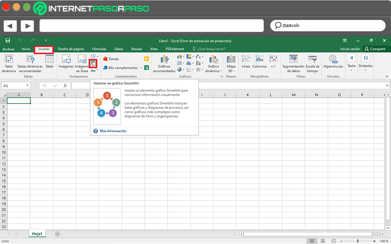
- Once you find yourself in bliss tab, locate the group called Illustrations. From there, click on the “SmartArt” option.

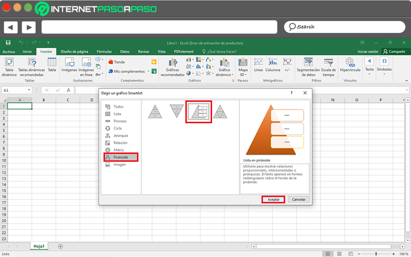
- After the above, automatically, a dialog box on screen, in which are all types of Smart Art mentioned in the previous part of the post. At that point, click on the one you want to include and thus, proceed to select the indicated subtype to click on “Accept”.

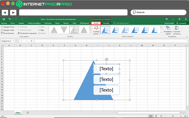
- Subsequently, it will display the chart in your spreadsheet and since then, you can start entering the text to display in the illustration in question.
- For this, you have two options, (1) Clicking on “[Texto]” to write there or (two) Copying text from another program, to click on “[Texto]” on the panel and paste it using the mouse or with the keyboard shortcut “Ctrl + V”.
- Additionally, you can customize your SmartArt graphic from the “SmartArt Tools > Design” tab at the top of the main window. Either for add shapes or bullets, change colors, layouts, or styles, and reset the chart.

- Also, directly from the “SmartArt Tools > Format” tabyou will be able to customize shapes, add fill, outline and effects to shapes and text, resize words, adjust them, align them, change their position, etc.

Computing