Index:
UPDATED ✅ Do you want to know how to make pie charts to show statistics in Microsoft Excel? ⭐ ENTER HERE ⭐ and learn everything FROM ZERO!
In case you need to study functionsor you have to analyze dispersion data, such as your company’s market share, you can use the pie chart tool.
With this function, you will be able to clearly expose a graph with 2 variables that are related to each other. To do this, you will have to follow a guide that we will show you in this post.
But this will not be the only thing you can access in this article, we will also show you all the tools you can use to make a pie chart without making mistakes and in a simple and fast way.
What are pie charts for and in what kind of documents are they good to use?
Pie charts are graphical tools that are used to expose information related to the participation that different elements have in a frequency distributionwhich is equal to 1 (or 100%).
In other words, these types of illustrations can show how each concept participates in the total population or sample. In other words, what is the percentage they contribute to the total set.
What tools do we have in Excel to create pie charts?
To create pie charts you need the tool “Recommended Graphics”which you can find in the menu “Insert”Within the group “Graphics”. You can also use the function “Insert Pie or Donut Chart”which belongs to the same group.
You can make these illustrations based on a table in which you can modify the data so that the areas of the circular graph are changed.
You can also use “Smart Art” to embed a pie chart, but you won’t have the dynamic changes like with the other tools. The same happens if you use “Insert images” from the computer or the Internet.
Steps to make pie charts to reflect statistics graphically in Excel

In case you need to present statistical information based on a pie or circular graph, you will need to know the steps that we will show you below so that you can present an illustration with a professional style.
The guide you should do is:
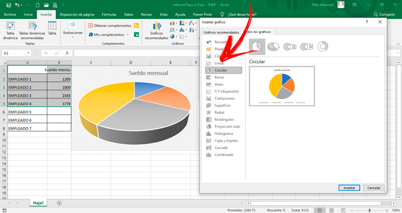
- Once you have the distribution table with the data, you will need to select the two scatter columns to get the graph.
- Then click on the tab “Insert” and look for the tool group “Graphics”. Select the function “Recommended Graphics”.
- Go to the tab “All charts”.
- Click on “Circular”.
- Choose the one that suits you.
What you can do now is modify chart title. For her, right click on that area to select it, then click on “Edit text” and write what you need. you can also change location the title by moving it with the mouse.
If you prefer, you can modify chart areaselecting the cake, and then dragging it in or out.
Another setting that is you will be able to remove the outline of the chart area from the legend or from the title. To do this, you will have to right click outside the graph and select “Outline”. You can also avoid the fill by leaving it transparent or changing its color. For the latter, you will have to click on the option “Filling”.
Computing